UX design changes
In February 2022, CC5 was released with a new design. After that date, the design has been updated consecutively with further improvements.
Here a list of the changes so far. This is an ongoing project, and more changes are about to come.
General
Complete Control has a new design with fresh new look and better readability. This shall make it easy to find important content and to have better control.
Here some rule of thumbs:
-
CC5 is faster
-
Improved contrasts and readability
-
Everything blue is clickable
-
Rounded edges for buttons
-
Streamlined button naming and placement
-
Ongoing project where "Create new" is replaced with "+" to remove obsolete text
Moved from side-menu to top menu
We move some sections from the side-menu to the top menu.

-
System settings: Direct access from the
 icon.
icon. -
Help: Moved to
 where you can also find your support contact information.
 -
News: Moved below the
 User profile icon.
 In addition, Global / selected company has moved from the right to the left side of the top menu.
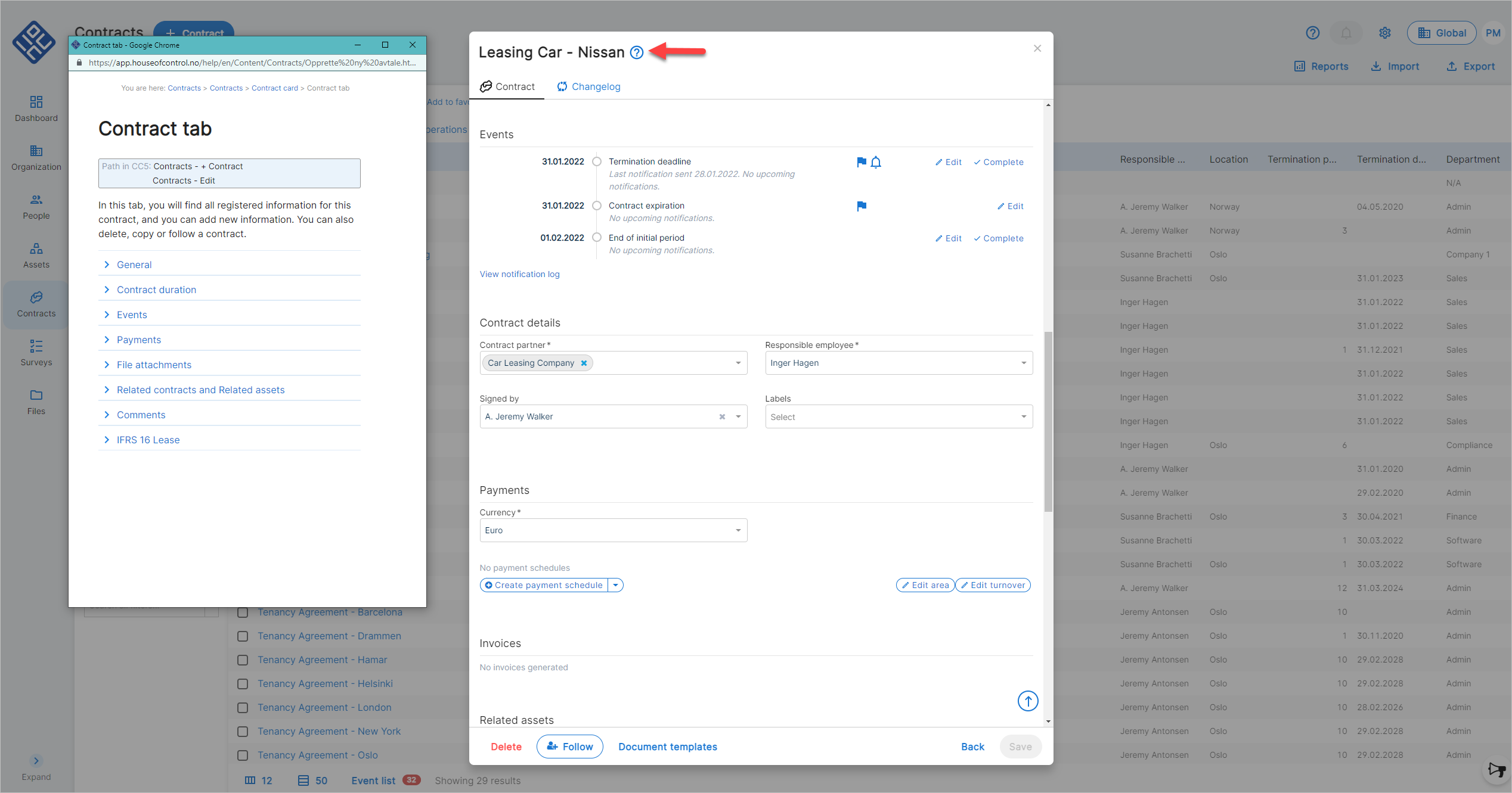
Get direct help in the window you're working with
Many windows have now a help button at the top. It immediately opens the correct help article. More windows will follow consecutively.
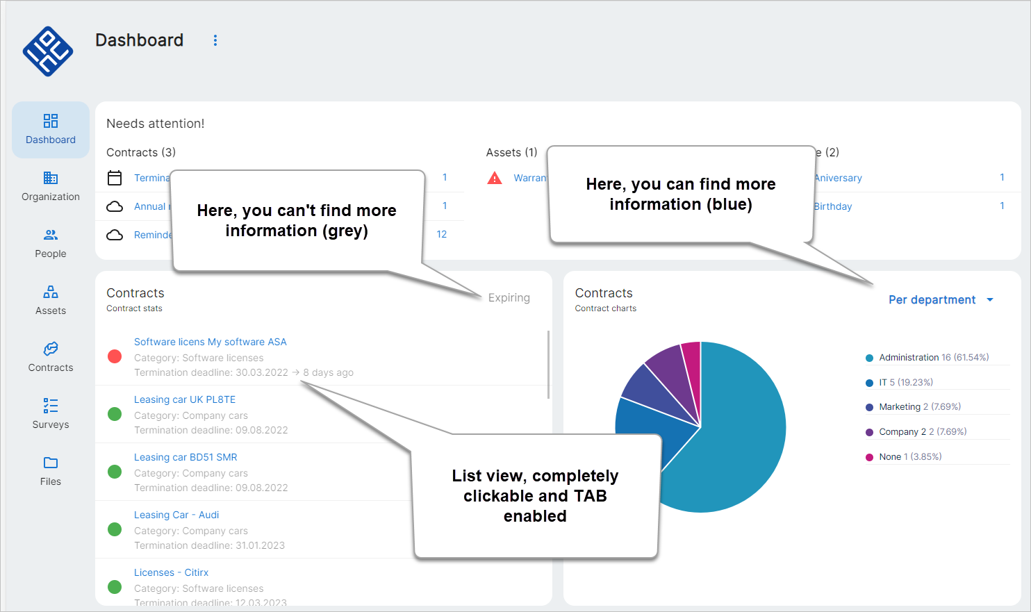
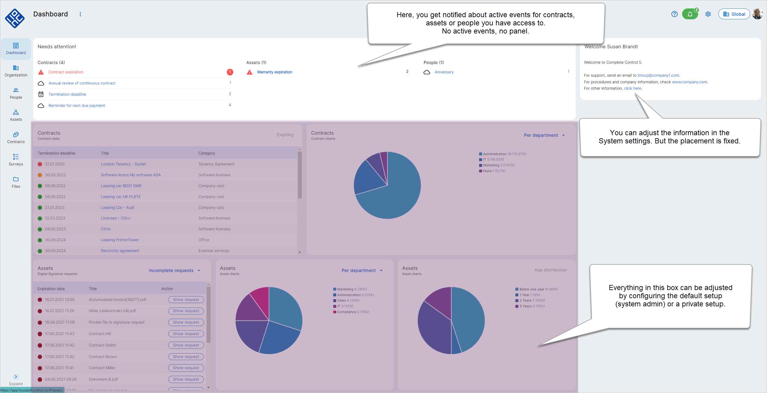
Dashboard changes
-
Additional panel owned by House of Control AS at the top and at the right (only displayed when applicable)
-
Current events at the top
-
Welcome message is moved to the right
-
All lists have been cleaned. The complete row is now a link
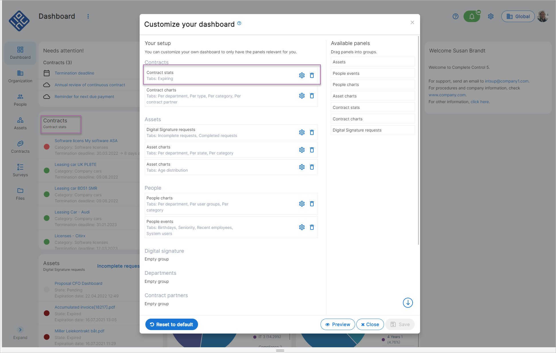
Changes to overview lists
Here, some functionality was moved from the top to the bottom of the lists. In long lists, the toolbar is fixed to the bottom of the page. Thus, you always have easy access.

-
Column picker
-
Number of displayed rows
-
Event list (if you have the optional module Advanced Notifications)
 New icon on existing contracts and signature requests
If you open a contract or signature request in view mode, you will see that there is a new icon on top of the card: Click to e.g. Edit, Delete, Follow and Copy.
Here, you can now also cancel signature requests.
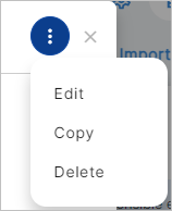
The contract card has now a new look and feel.
Note!
All changes are pure design changes - the functionality is still the same.
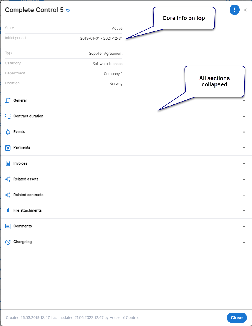
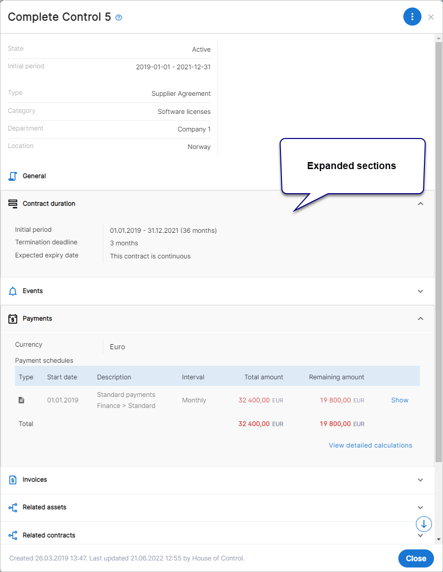
More space and less scrolling via dropdown sections
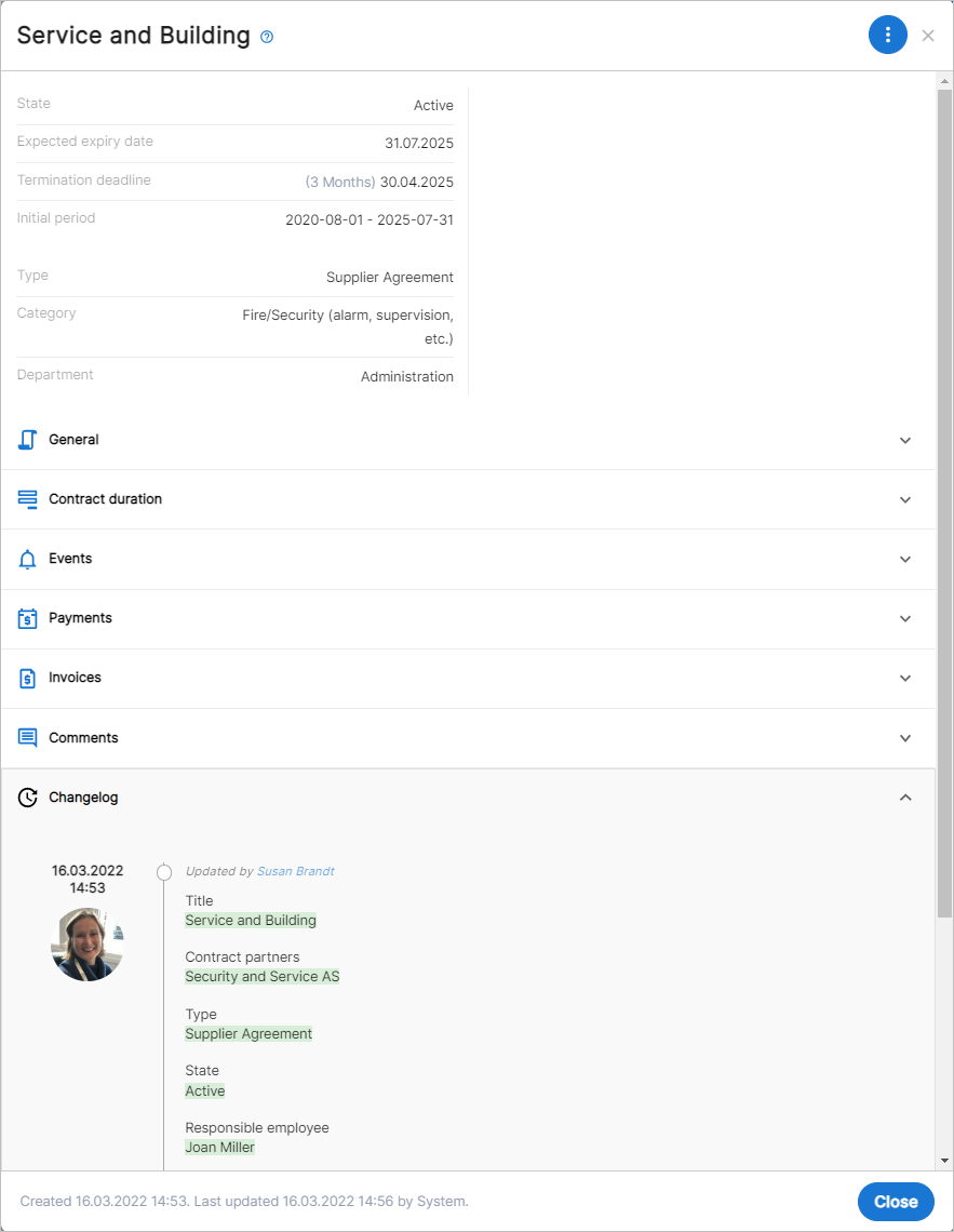
The headings of the old contract card are now replaced by dropdown sections. The intention is to conserve space and help you avoid scrolling to find content on the card alongside with a cleaner look and feel.
By default, the dropdown sections are collapsed, but you can see some extracted core information about this contract on top of the card. This gives you the most important information at a glance. And if you want to dive into details, simply click the section to expand it. Then click again to collapse it again - if you want.
Tip!
If you expand a section in view mode and then switch to editing mode, sections you expanded in the view mode remain expanded - so that you quickly can enter your changes. In editing mode, the head information is also removed, and the General section is expanded.
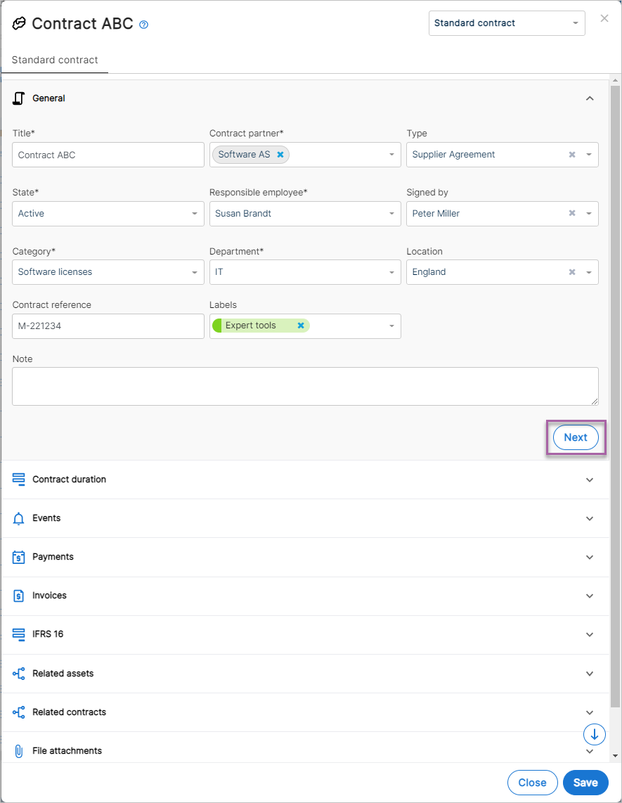
"Light" wizard for contract registration
There are many fields on the contract card - and little space. It's easy to get lost, especially if you also need to scroll upwards and downwards to find specific fields.
To avoid these situations, a "light" wizard will now guide you through the various sections when creating new contracts. Simply start by clicking + Contract in the usual way. Then, enter all required information in the first section and click Next to go to the next section.
Note that the wizard does not force you to enter information in a certain order. You can still open all sections manually.
Removed Changelog tab
The contract card is no longer divided into two separate tabs, and you can now find the changelog in the Changelog section at the bottom.
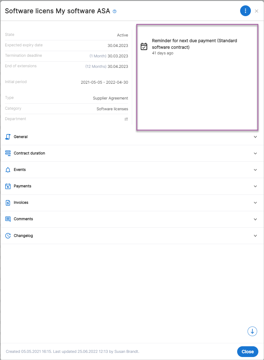
Notifications in top position
In the near future, notifications will be more visible on the contract card.
Note!
At the moment, you can only see that the contract is linked to certain events. But soon, you can find and manage here all your notifications.
New person and partner card design
The design of the person and partner card is now aligned with the contract card for a better user experience. Also, some new functionality is implemented.
Get a first impression of the changes in the video.
Here a short summary:
-
icon for access to actions such as Edit and Delete in view mode.
-
Clear sectioning of content via dropdown lists. Core content is displayed in the header section on the left side.
-
 An Expand All icon expands all dropdown lists on one click. This icon is now also available on the contract card.
 -
Event notifications in the header section on the right side on the person card. On the partner card, a comment box displays the last entered comment.
-
You can create contracts directly from the partner card.
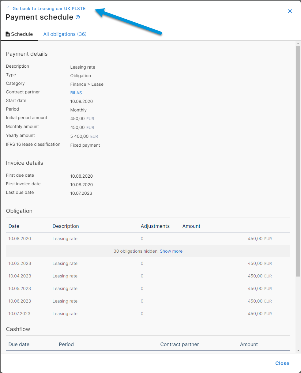
New window navigation
When opening a window from another window in CC5, you will now find a link on top of the window. Click to return to the previous window.